Dashboard

Comprehensive guide to using the JCAA Billing System Dashboard

Dashboard Overview

Overview

The Dashboard is the main landing page of the JCAA Billing System. It provides a comprehensive overview of key financial metrics, invoice statuses, and analytical charts to help you monitor the billing system's performance at a glance.

Dashboard Layout

The dashboard is organized into several key areas:

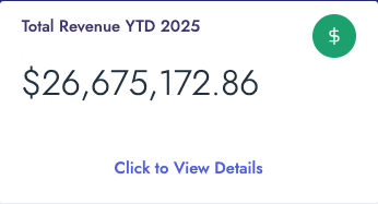
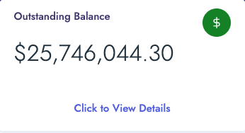
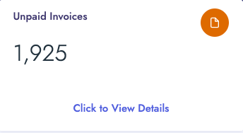
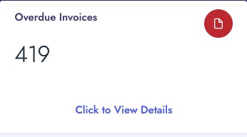
  • Summary Cards (Top Row): Four key metric cards displaying YTD Revenue, Outstanding Balance, Unpaid Invoices, and Overdue Invoices
  • Navigation Tiles (Second Row): Quick access tiles to specialized dashboards (PASC and AIRNAV Analysis)
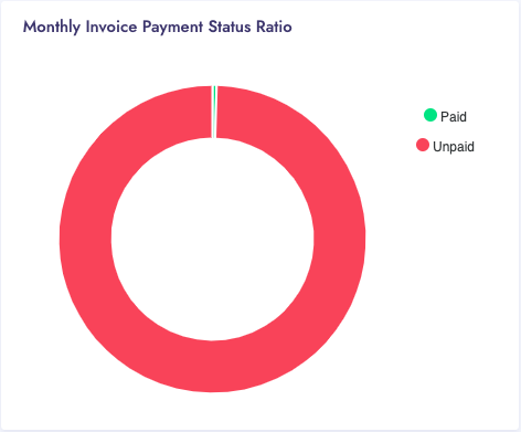
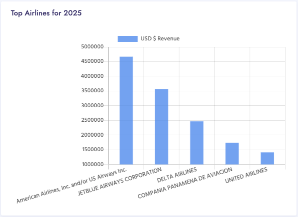
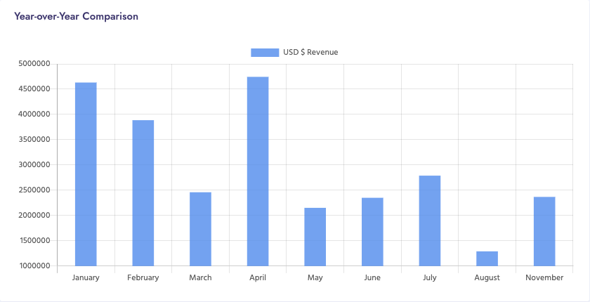
  • Charts and Visualizations (Third & Fourth Rows): Interactive charts showing payment status, top carriers, and year-over-year comparisons
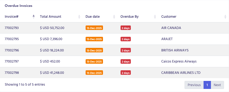
  • Data Tables: Detailed tables listing overdue invoices

Data Loading

Most dashboard components load data dynamically via AJAX when the page loads. You may see "Loading..." indicators while data is being fetched from the server.

YTD Revenue Card

Overview

The YTD (Year-to-Date) Revenue card displays the total revenue generated from the beginning of the current year up to the present date. This metric provides a quick snapshot of your financial performance for the year.

Location

Top-left card in the dashboard summary section (first card, leftmost position).

Visual Design

  • Blue/info-themed card with a dollar sign icon
  • Card title displays dynamically (e.g., "Revenue YTD")
  • Large display number showing the revenue amount in USD
  • Footer section with "Click to View Details" message

How to Use

  1. View the YTD revenue amount displayed on the card
  2. Click anywhere on the card to view detailed revenue reports
  3. The detailed report page shows a breakdown of revenue by various criteria

Data Source

The revenue data is calculated from all invoices generated in the current year, regardless of payment status.

YTD Revenue Card

Outstanding Balance Card

Overview

The Outstanding Balance card shows the total amount of money that is currently owed to your organization. This includes all unpaid invoices regardless of their due date status.

Location

Second card from the left in the dashboard summary section.

Visual Design

  • Green/success-themed card with a dollar sign icon
  • Card title displays dynamically (e.g., "Outstanding Balance YTD")
  • Large display number showing the outstanding balance amount in USD
  • Footer section with "Click to View Details" message

How to Use

  1. View the outstanding balance amount displayed on the card
  2. Click the card to navigate to detailed outstanding balance reports
  3. Use the detailed reports to identify which customers have outstanding balances

Data Source

The outstanding balance is calculated from all invoices that have not been fully paid, including both current and overdue invoices.

Outstanding Balance Card

Unpaid Invoices Card

Overview

The Unpaid Invoices card displays the total count of invoices that have not yet been paid. This metric helps you quickly identify how many invoices are pending payment.

Location

Third card from the left in the dashboard summary section.

Visual Design

  • Yellow/orange warning-themed card with a file icon
  • Card title displays dynamically (e.g., "Unpaid Invoices")
  • Large display number showing the count of unpaid invoices
  • Footer section with "Click to View Details" message

How to Use

  1. Monitor the unpaid invoice count displayed on the card
  2. Click the card to view a detailed list of all unpaid invoices
  3. Use the detailed view to take action on specific unpaid invoices

Data Source

The unpaid invoice count includes all invoices that have not been fully paid, regardless of whether they are current, overdue, or not yet due.

Unpaid Invoices Card

Overdue Invoices Card

Overview

The Overdue Invoices card shows the total count of invoices that have passed their due date without payment. This is a critical metric for identifying invoices that require immediate attention.

Location

Fourth card (rightmost) in the dashboard summary section.

Visual Design

  • Red/danger-themed card with a file icon
  • Card title displays dynamically (e.g., "Overdue Invoices")
  • Large display number showing the count of overdue invoices
  • Footer section with "Click to View Details" message

How to Use

  1. Check the overdue invoice count regularly to monitor payment delays
  2. Click the card to access detailed overdue invoice information
  3. Use the detailed view to identify which customers have overdue invoices and take appropriate action

Data Source

The overdue invoice count includes all invoices where the due date has passed and the invoice has not been fully paid.

Overdue Invoices Card

Airport PASC Analysis Dashboard Navigation Tile

Overview

The Airport PASC (Passenger Service Charge) Analysis Dashboard provides specialized analytics and reporting for airport passenger service charges. This dashboard offers detailed insights into PASC-related billing and revenue data.

Location

Navigation tile in the second row of the dashboard, left side.

How to Use

  1. Click on the "Airport PASC Analysis Dashboard" tile
  2. You will be redirected to the PASC dashboard page
  3. Explore various PASC-related reports and analytics available on that page

What You'll Find

The PASC Dashboard provides:

  • Passenger movement statistics
  • Revenue analysis by airport
  • Trend analysis and comparisons
  • Detailed PASC billing reports
PASC Dashboard Navigation Tile

AIRNAV Analysis Dashboard Navigation Tile

Overview

The AIRNAV Analysis Dashboard provides specialized analytics and reporting for air navigation services. This dashboard offers detailed insights into AIRNAV-related billing, revenue, and operational data.

Location

Navigation tile in the second row of the dashboard, right side.

How to Use

  1. Click on the "AIRNAV Analysis Dashboard" tile
  2. You will be redirected to the AIRNAV dashboard page
  3. Explore various AIRNAV-related reports and analytics available on that page

What You'll Find

The AIRNAV Dashboard provides:

  • Flight movement statistics
  • Revenue analysis by carrier and route
  • Air navigation service charge breakdowns
  • Trend analysis and year-over-year comparisons
AIRNAV Dashboard Navigation Tile

Monthly Invoice Payment Status Ratio Chart

Overview

The Monthly Invoice Payment Status Ratio chart displays a visual representation of paid versus unpaid invoices for the current month. It uses a donut chart format to show the proportion of paid and unpaid invoices at a glance.

Location

Left side of the third row, occupying 4 columns in the grid layout (col-4 col-lg-4).

How to Use

  1. View the chart to see the proportion of paid vs unpaid invoices
  2. The green segment represents paid invoices
  3. The red segment represents unpaid invoices
  4. Use this visual to quickly assess the payment status for the current month

Data Source

The chart uses data from invoices generated in the current month.

Chart Configuration

  • Chart Type: Donut
  • Labels: "Paid", "Unpaid"
  • Colors: Green (#00E396) for Paid, Red (#FF4560) for Unpaid
  • Data Labels: Disabled
  • Height: 350px
Payment Status Ratio Chart

Overdue Invoices Table

Overview

The Overdue Invoices table displays a detailed list of the top five overdue invoices, showing critical information such as invoice numbers, amounts, due dates, days overdue, and customer names. This table helps you quickly identify and prioritize invoices that need immediate attention.

Location

Right side of the third row, occupying 8 columns in the grid layout (col-12 col-lg-8).

Table Structure

The table contains the following columns:

  • Invoice#: The unique invoice number (always visible)
  • Total Amount: The invoice amount in USD (hidden on smaller screens, visible on xl screens)
  • Due Date: The original due date of the invoice displayed with a warning badge (always visible)
  • Overdue By: Number of days the invoice is past due, displayed with a danger badge (hidden on smaller screens)
  • Customer: The name of the customer associated with the invoice (hidden on smaller screens)

Visual Features

  • DataTable integration for enhanced functionality
  • Color-coded badges:
    • Warning badge (yellow) for due dates
    • Danger badge (red) for overdue days
  • Striped rows for better readability
  • Responsive design - some columns hidden on smaller screens

How to Use

  1. Review the list of overdue invoices displayed in the table
  2. Check the "Overdue By" column to see how many days each invoice is overdue
  3. Identify the customer name to contact them about payment
  4. Note the invoice amount to understand the financial impact
  5. Use pagination controls if there are more than 6 invoices (though only top 5 are shown)
Overdue Invoices Table

Top Carriers Chart

Overview

The Top Carriers chart displays a horizontal bar chart showing the top performing carriers ranked by USD revenue. This visualization helps you identify which carriers generate the most revenue for your organization.

Location

Left side of the fourth row, occupying 5 columns in the grid layout (col-12 col-lg-5).

How to Use

  1. Wait for the loading indicator to disappear (data is fetched from the server)
  2. View the chart title which indicates the time period and data type
  3. Review the horizontal bars to see which carriers have the highest revenue
  4. Bars are ordered from highest to lowest revenue (top to bottom)
  5. Use this information to identify your top-performing carriers
Top Carriers Chart

Year-over-Year Revenue Chart

Overview

The Year-over-Year Revenue chart displays a horizontal bar chart comparing revenue performance across different time periods (typically comparing current year to previous year). This visualization helps you track revenue trends and growth over time.

Location

Right side of the fourth row, occupying 7 columns in the grid layout (col-12 col-lg-7).

How to Use

  1. Wait for the loading indicator to disappear (data is fetched from the server)
  2. View the chart title which indicates the comparison period
  3. Review the horizontal bars to compare revenue across different time periods
  4. Use this information to identify revenue trends and growth patterns
  5. Compare current period performance against previous periods

Use Cases

  • Compare current year revenue to previous year
  • Track month-over-month revenue growth
  • Identify seasonal trends
  • Assess business performance over time
Year-over-Year Revenue Chart